Skip to content

Madar brand book

Star navigation by daylight: an identity inspired by Suhail, the star travellers steered by, and the first day at the office.

Story & meaning

Madar (مدار) means 'orbit' — the path a star travels. For centuries Arabs navigated desert and sea by the stars, and Suhail (Canopus) was the most famous: its rising over Arabia signalled the end of summer heat and a new season. Madar is a Saudi career-simulation platform where trainees step into a realistic workplace and practise before they begin.

The visual idea is 'Star Navigation': the trainee is the star, the orbit is their career path, and the weave (Sadu) is the community and craft around them. Premium and national in spirit — never governmental in appearance.

«Madar by Day» moves from the night sky into daylight: the first day at the office is the hero, the product itself is the image, and the Suhail star stays the guide at the trainee's side.

  • Guidance: we point the way, we don't dictate.
  • Authenticity: Saudi roots, contemporary language.
  • Precision: clear measurement, honest reports.
  • Warmth: human companionship at every step.
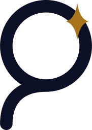
AMeem-orbit + Suhail starPrimary

The letter م drawn geometrically as a closed orbit whose tail descends like a launch trajectory; a four-point Suhail star travels on it. The star is the trainee, the orbit is their career journey. Registrable as a composite mark (symbol + «مدار»).


BSadu rings

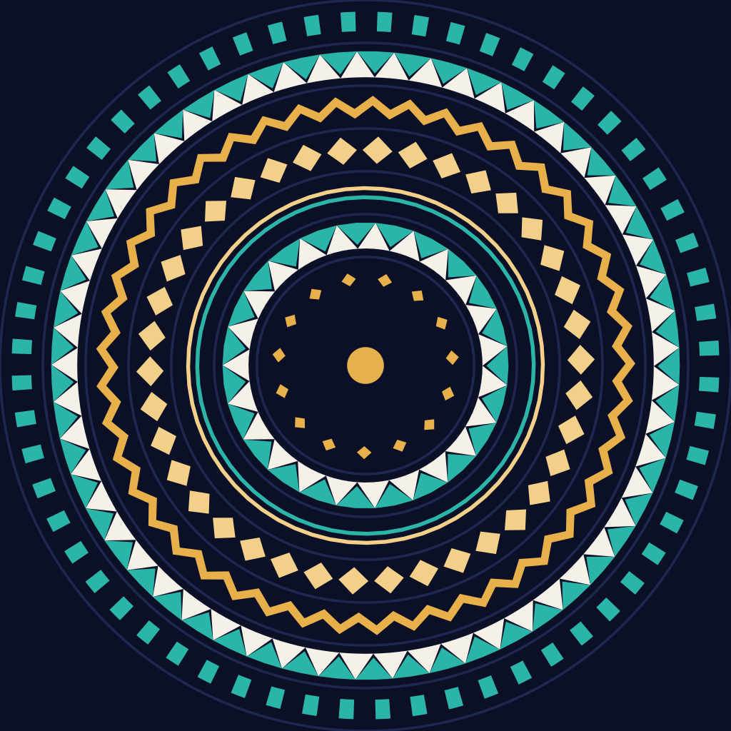
Concentric orbits framing a woven band of alternating Sadu 'teeth', with a golden eye (diamond) at the centre. Rich and warm; ideal for seals, readiness reports and print.


CMonoline orbit

A single tilted elliptical orbit wrapping a hollow planet, the star at its leading edge. Minimal and technical; suits tiny icons and motion.
DWordmark

«مدار» in a hand-drawn soft-Kufi monoline with the Suhail star rising above the alif, paired with a Latin «MADAR» of the same stroke.


Clearspace & minimum size

Clearspace unit = the height of the Suhail star in the logo (x). Keep at least x clear on every side — no text, image or edge may enter.

ElementScreenPrint
Symbol16px (favicon), 24px UI6 mm
Horizontal lockup24px height8 mm
Stacked lockup56px height18 mm
Bilingual32px height11 mm

Below 24px use the symbol alone in its icon cut — favicon.svg.

Misuse

Do
  • Use only the master files from /brand.
  • Place the logo on white (canvas) or panel; use the on-dark file on ink panels and in dark mode.
  • Use the mono version when two colours aren't possible.
Don't
  • Don't stretch, squash, skew or rotate the logo.
  • Don't recolour it; the star is Suhail gold or the line colour — nothing else.
  • Don't move the star in the static logo (motion is for loaders only).
  • Don't set «مدار» in another typeface next to the symbol.
  • Don't add shadows, glows, gradients or outlines.
  • Don't place it on busy or low-contrast backgrounds.
  • Never combine it with the national flag, emblem or Vision 2030 marks.

Colour system «Madar by Day»

The identity is light-first: a calm white page, deep indigo ink for text and the primary button, Atlas blue for links, selection and saturated panels, and the Suhail gold star for graphics only. Four soft pastels (butter, blush, mint, sky) set apart cards and moments of the experience. Dark mode is opt-in from the header toggle, remembered per user, and never follows the device setting.

LightDefault
Surfaces
canvas#FFFFFF
18.18:1
panel#F3F5FA
16.67:1
raised#FFFFFF
18.18:1
sunken#EBEEF6
15.67:1
Ink
  • Your first dayink#0E133015.67:1
  • Your first dayink-soft#5B63805.10:1
  • Your first dayink-faint#646B864.53:1
Atlas blue
Apply nowApply nowYour first dayfocus
accent#2F43E06.03:1
accent-strong#2233B89.40:1
accent-soft#EEF1FF6.22:1
on-accent#FFFFFF6.99:1
focus#2F43E06.99:1
Lines
line#E6E9F21.21:1Decorative
line-strong#858DA83.29:1
Suhail star
suhail#F0B4291.86:1Graphics only
Card pastels
butter#FFE37A
14.30:1
blush#FFCADB
12.75:1
mint#BDEBD3
13.84:1
sky#D9E3FF
14.18:1
States
success#17703F / #E3F5EB5.40:1
warn#8A5200 / #FFF1D65.72:1
danger#B42318 / #FDE7E55.55:1
DarkOpt-in
Surfaces
canvas#0B1026
16.68:1
panel#111733
15.60:1
raised#182046
13.96:1
sunken#070B1C
17.35:1
Ink
  • Your first dayink#F5F1E813.96:1
  • Your first dayink-soft#A3ABCB6.93:1
  • Your first dayink-faint#9098BC5.55:1
Atlas blue
Apply nowApply nowYour first dayfocus
accent#7B88FF5.10:1
accent-strong#98A3FF8.07:1
accent-soft#1C25524.74:1
on-accent#0B10266.09:1
focus#F3D08A12.72:1
Lines
line#232C581.40:1Decorative
line-strong#5A68A83.56:1
Suhail star
suhail#F0B42910.09:1Graphics only
Card pastels
butter#3B3316
11.14:1
blush#3A1F2B
13.20:1
mint#173A2C
11.10:1
sky#1C2552
12.97:1
States
success#3CCB7F / #10301F6.85:1
warn#F5A524 / #35260A7.18:1
danger#FF6B70 / #3A14165.87:1

Each ratio is the role's contrast on its weakest surface: text ≥ 4.5:1, strong lines and the focus ring ≥ 3:1.

ColourHEXRole
Page white#FFFFFFBackground
Indigo ink#0E1330Text, primary button
Atlas blue#2F43E0The signature accent
Suhail gold#F0B429The star and graphics only
Butter#FFE37ACard
Blush#FFCADBCard
Mint#BDEBD3Card
Sky#D9E3FFCard

Components never use these values directly; they use semantic roles that flip with the theme. Classes such as bg-canvas, text-ink, border-line and bg-accent are generated from tokens.ts into tailwind.css. The contrast columns show each role's weakest ratio in each theme.

RoleLightLight contrastDarkDark contrastUse
canvas#FFFFFF18.18#0B102616.68Page background
panel#F3F5FA16.67#11173315.60Large panels, alternate sections, console pages
raised#FFFFFF18.18#18204613.96Cards, menus, dialogs
sunken#EBEEF615.67#070B1C17.35Inputs, wells, progress tracks
line#E6E9F21.21#232C581.40Quiet borders and dividers
line-strong#858DA83.29#5A68A83.56Input borders, important dividers
ink#0E133015.67#F5F1E813.96Primary text; the primary button in light
ink-soft#5B63805.10#A3ABCB6.93Secondary text, paragraphs
ink-faint#646B864.53#9098BC5.55Small labels, table headers
accent#2F43E06.03#7B88FF5.10Links, selection, saturated panels
accent-strong#2233B89.40#98A3FF8.07Hover and pressed blue
accent-soft#EEF1FF6.22#1C25524.74Soft highlights and badges
on-accent#FFFFFF6.99#0B10266.09Text on blue
focus#2F43E06.99#F3D08A12.72Focus ring (2px, 2px offset)
butter#FFE37A14.30#3B331611.14Colour card, ink text on top
blush#FFCADB12.75#3A1F2B13.20Colour card
mint#BDEBD313.84#173A2C11.10Colour card
sky#D9E3FF14.18#1C255212.97Colour card, avatars
success#17703F5.28#3CCB7F7.52Success text
success-soft#E3F5EB5.40#10301F6.85Success fill
warn#8A52005.50#F5A5247.71Warning text
warn-soft#FFF1D65.72#35260A7.18Warning fill
danger#B423185.66#FF6B705.68Error text
danger-soft#FDE7E55.55#3A14165.87Error fill
suhail#F0B4291.86#F0B42910.09The Suhail star and graphics only, never text
Do
  • Use UI roles only (bg-canvas, text-ink, border-line, bg-accent…); never hard-code HEX in components.
  • The primary button is ink with canvas text (18.18:1); blue is for links, selection and the accent button (on-accent text at 6.99:1).
  • Text on pastel cards is always ink; in dark mode the pastels become deep tints of the same hue.
  • Flat cards are raised with a line border, on canvas or panel.
Don't
  • Never use Suhail gold #F0B429 as text in either theme: 1.86:1 on white fails.
  • No Tailwind default colours (blue-500, gray-*) and no legacy palette names (night, star, gold, teal, mist) in the UI — a guard test rejects them.
  • Don't follow the OS colour scheme; light is always the default.

Every text role is checked automatically (WCAG AA ≥ 4.5:1) on all four surfaces in both themes, and strong lines and the focus ring at ≥ 3:1, in packages/brand/src/tokens.test.ts. The old night palette (night indigo, sand gold, teal) stays in @madar/brand for the 3D office, emails and PDFs only.

Typography

Two families only. Alexandria for headings, numbers and the clock: a wide geometric face with the spirit of contemporary signage that gives numbers presence. IBM Plex Sans Arabic for body and interface: clear at small sizes, with legible digits. Both are OFL and self-hosted in /brand/fonts with their licences.

مدار8:45
Alexandria
Headings, numbers and the clock
Weights400500700
أبجد Aa
IBM Plex Sans Arabic
Body text and interface
Weights400500600
  1. text-hero
    40–88px / 1.12 / 500
    Alexandria
    Try your first day
  2. text-display
    32–60px / 1.18 / 500
    Alexandria
    before it begins
  3. text-h1
    28–44px / 1.22 / 500
    Alexandria
    A whole office is waiting
  4. text-h2
    26–40px / 1.25 / 500
    Alexandria
    Your first day, hour by hour
  5. text-h3
    21px / 1.45 / 500
    Alexandria
    Meet the guide at 9:30
  6. text-h4
    18px / 1.5 / 600
    IBM Plex Sans Arabic
    CV analysis
  7. text-body-lg
    18px / 1.8 / 400
    IBM Plex Sans Arabic
    A work week in a virtual office with a full team, and a short interview with the Madar guide.
  8. text-body
    16px / 1.75 / 400
    IBM Plex Sans Arabic
    Walk the office, join the meetings and hand your work to a manager who reviews it. Everything you learn shows in your readiness report.
  9. text-small
    14px / 1.6 / 400
    IBM Plex Sans Arabic
    The decision is saved to the audit log under the reviewer's name.
  10. text-caption
    13px / 1.5 / 500
    IBM Plex Sans Arabic
    Last active 2 hours ago
  11. text-label
    13px / 1.4 / 600
    IBM Plex Sans Arabic
    Valid for (days)
  12. text-mono
    14px / 1.6 / 400
    IBM Plex Mono
    --color-accent: #2F43E0
  • Never letter-space Arabic, never justify with kashida. Negative tracking (-0.01em) is for Latin headings only.
  • Weights: Alexandria 400, 500, 700 (500 for headings); Plex 400, 500, 600.
  • Times and changing numbers use tabular figures (.tabular) so they don't jitter.
  • Keep body lines to about 65 characters.
  • Never: italics, recolouring one word of a headline, small eyebrow labels above every heading, or an arrow appended to button text.
  • The Ministry of Culture 'Saudi Font' forbids hosting and redistribution without written approval, so it is not used on the web.

Shape & elevation

Roundness grows with the size of the surface: panels are rounder than cards, cards rounder than inputs. Buttons, badges and the floating header are full pills.

rounded-full
999px
Buttons, badges, chips, the floating header
rounded-panel
28px
Large panels and dialogs
rounded-card
20px
Cards
rounded-chip
16px
Small floating chips
rounded-control
12px
Inputs and menus
Flat card: raised with a line border
Floating chip: shadow-float
primary

Ink pill, canvas text: the one main action per screen

accent

Atlas blue: an on-brand action inside a panel (mic, copy)

secondary

Raised with a line border: save and secondary actions

outline

1.5px ink border: the alternative next to primary

ghost

No fill: cancel and small tools

danger

Irreversible actions

One shadow only, for floating things: small floating chips, popovers and dialogs. Regular cards stay flat — raised with a line border, no shadow. In dark mode it gains a crisp outline.

Themeshadow-float
Light0 18px 40px -18px rgb(14 19 48 / 0.35), 0 2px 6px rgb(14 19 48 / 0.06)
Dark0 0 0 1px #34407A, 0 18px 40px -18px rgb(0 0 0 / 0.6)

Button sizes: sm 36px, md 44px, lg 52px tall; touch targets on mobile are at least 44px. The focus ring is always visible.

Sadu pattern

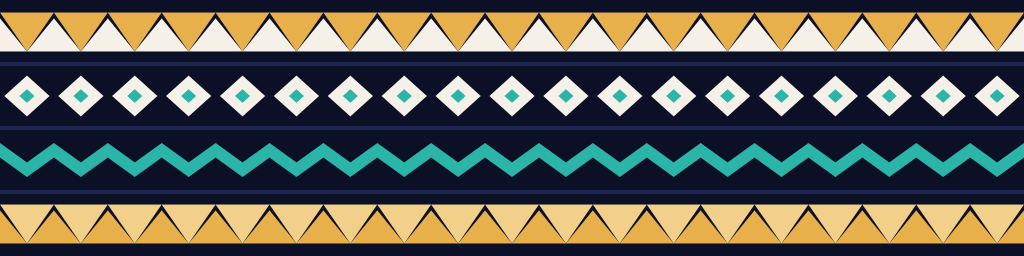
The pattern is generated from authentic Sadu motifs — teeth (alternating triangles), eyes (diamonds), chevrons, dots, stripes and ladder — bent into orbital rings or laid straight as a seamless strip.

Do
  • Use it as a supporting device: certificates and printed reports, rugs and walls in the 3D office.
  • Keep it at 8–20% opacity behind text.
  • One ring set or one strip per screen.
Don't
  • Don't place it directly behind the logo or inside its clearspace.
  • Don't recolour it outside the palette or run it at full contrast behind text.
  • Don't present it as authentic woven Sadu; it is an homage.

Iconography

  • 24px grid, 1.75px monoline, round caps and joins — the same logic as the orbit stroke.
  • Simple geometry, outline by default; fill only for the active state or the star.
  • Directional icons (arrows, progress, back) mirror in RTL; clocks and logos never mirror.
  • Library: lucide-react at 1.75 stroke; decorative icons carry aria-hidden. Hand-drawn paths are for the logo and the Suhail star only.
  • 3D objects are illustration, never a substitute for icons.

Motion principles

Motion is orbital: things don't jump, they travel and settle. The default 'orbit' easing is cubic-bezier(.2,.7,.2,1) — decisive start, soft landing. Entering elements use 'rise' (a star clearing the horizon), exiting ones use 'set'.

TokenValueUse
fast120mshover, press
base200msUI transitions
slow420mspanels, page transitions
orbit12s linearambient rings / background
loader2.4s linearorbitLoaderSvg()
  • One orchestrated entrance per page, 1.2 seconds or less.
  • Scroll-linked motion in CSS (animation-timeline) inside @supports, with no motion libraries.
  • A calm bob for floating chips (6s, ±6px); pointer parallax up to 12px on fine pointers only.
  • No fade-up on every section, no hover effect on every card.
  • Loader: the star circles the meem orbit at constant speed.
  • Respect prefers-reduced-motion: non-essential motion stops, video shows its still poster, and no content stays hidden.

Voice & tone

We write in professional 'white' Saudi Arabic: clear, warm, respectful — neither stiff nor heavy dialect. Characters inside the simulation speak the professional register of Riyadh offices. Legal text and policies are in Modern Standard Arabic.

Instead ofWe write
تم رفض طلبكما اكتمل الطلب — راجع الحقول المظللة وجرّب مرة ثانية
خطأ في النظامصار خلل عندنا، جرّب بعد لحظات
شهادة إتمامتقرير الجاهزية
Submitإرسال

Gendered address: we never ask for or infer gender. Default to neutral constructions (verbal nouns, plural, 'let's begin', 'you can'). Settings offer an optional 'form of address' preference (masculine / feminine / neutral) that changes wording only and is never used in scoring or reports.

Digits: Latin digits (0-9) across the digital UI, data and reports for legibility and system/search compatibility (Intl: ar-SA-u-nu-latn). Arabic-Indic digits (٠-٩) are allowed only in ceremonial print and literary text. Never mix both systems on one screen.

Dates: Gregorian is primary in the UI; Hijri (Umm al-Qura) appears alongside in reports and formal documents (Intl: ar-SA-u-ca-islamic-umalqura).

  • AI: always disclose when a speaker is an AI character.
  • No hiring promises; say 'readiness', never 'guarantee'.
  • Short sentences, verb first, one primary action per screen.

Co-branding 'Madar × Partner'

When Madar appears with a partner (university, employer, training body) we use a fixed lockup: Madar logo, thin vertical divider, partner logo — at equal optical height.

Do
  • Equal optical height (geometric height may differ).
  • 1px (0.25 mm) divider in the line colour, with x clearspace either side.
  • Arabic: Madar right, partner left. English: reversed.
  • Partner colour may be used only as a secondary accent in co-branded programme material.
  • Obtain written partner approval for every use of their logo.
Don't
  • Never recolour or alter a partner logo.
  • Never replace Madar's core colours with the partner's.
  • Never place a partner logo inside the symbol or in place of the star.
  • No partner logos in the platform's generic OG image.

Imagery & characters

Imagery is daylight: soft 3D objects in sunlight, a miniature Saudi office crossed by palm-frond shadows, and the tools of a workday (calendar, microphone, finjan, document). The palette is Atlas blue, Suhail gold and white only. No text, letters, logos or flags inside images.

'Madar Guide': two fictional mentor characters (a man in thobe and shemagh, a woman in abaya and hijab), modest, professional and friendly. They are fictional and always disclosed as AI.

  • Stills are generated with codex and short motion loops with Veo on Google Cloud; every asset's source, tool and prompt is recorded in provenance.json.
  • 3D office characters: refined stylised look, never caricatured, varied ages and skin tones.
  • Attire modest and professional: thobe with shemagh/ghutra, abaya with hijab, business suits.
  • No real people without documented consent; generated images are labelled 'AI-generated'.
  • The first mood board and character concepts in docs/brand/imagery remain the character reference; landing assets live in /brand/landing.

Assets

  • Logos: /brand/logo/*.svg (+ PNG)
  • Icons: /brand/favicon.svg, favicon-32.png, apple-touch-icon.png (180), icon-192.png, icon-512.png, icon-maskable-512.png
  • Share image: /brand/og-image.png (1200×630)
  • Landing imagery and loops: /brand/landing/* (AVIF and WebP at two widths + provenance.json)
  • Patterns: /brand/pattern/*.svg
  • Fonts: /brand/fonts/*.woff2 (Alexandria, IBM Plex Sans Arabic) + fonts.css + licences
  • Code: @madar/brand — ui, day, floatShadow, typeScale (UI roles), the generated tailwind.css, madarMark(), lockupSvg(), orbitLoaderSvg(), saduSvg()